Data Science Portfolio
Describes all my data science experience, with links to individual projects.
Describes all my data science experience, with links to individual projects.
Walks through required steps to use Plotly/Plotly express and Dash with Jupyter Lab
Why I love Tidy Tuesday
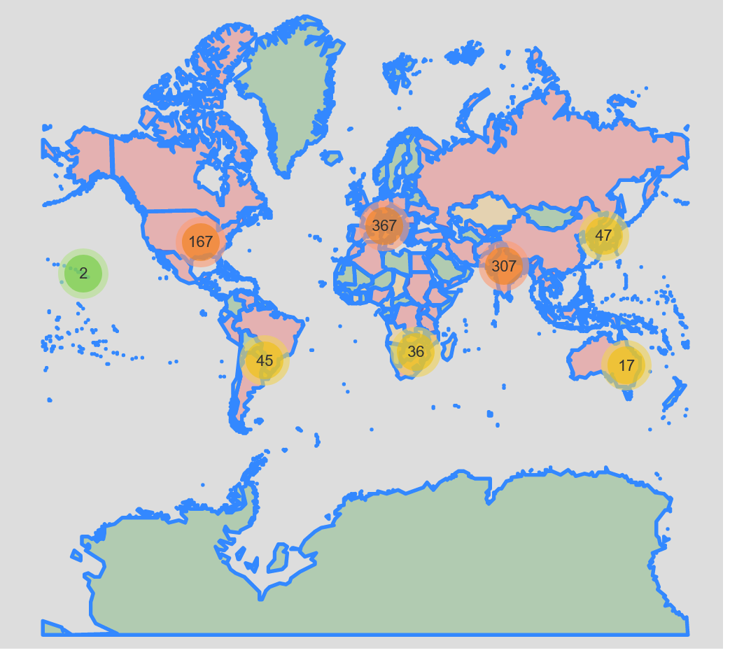
How to visualize geospatial data
Google searches for ‘It Is Wednesday My Dude’ are most popular on Wednesdays.