# ensure our graphs are displayed inline
%matplotlib inline
import os
import pandas as pd
import matplotlib.pyplot as plt
import seaborn as sb
import numpy as np
import folium
from folium import plugins
from folium.plugins import HeatMap
from folium.plugins import MarkerCluster
# useful to define where we'll be storing our data
data_directory = "data/"

# useful to define where we'll be storing our output
output_directory = "output/"
Introduction
Our goal today is to create some visualizations for some geospatial data. We’ll do that by first acquiring the data itself, quickly looking at the data set and doing a very minor cleanup.
Then we’ll walk through creating multiple visualizations, which can be applied to many data sets. Specifically we’ll bedoing the following:
- display geospatial data
- cluster close points
- generate a heat map
- overlay census population data
Data Acquisition
First we’ll create a Pandas.DataFrame out of a json file hosted by NASA.
# Data from NASA on meteorite landings
df = pd.read_json(data_directory + "y77d-th95.json")
Now we’ll simply do some high level overview of the data.
Initial Data High Level View
I like to always start out by looking at the thirty thousand foot view of any data set.
df.info()
<class 'pandas.core.frame.DataFrame'>
Int64Index: 1000 entries, 0 to 999
Data columns (total 12 columns):
:@computed_region_cbhk_fwbd    133 non-null float64
:@computed_region_nnqa_25f4    134 non-null float64
fall                           1000 non-null object
geolocation                    988 non-null object
id                             1000 non-null int64
mass                           972 non-null float64
name                           1000 non-null object
nametype                       1000 non-null object
recclass                       1000 non-null object
reclat                         988 non-null float64
reclong                        988 non-null float64
year                           999 non-null object
dtypes: float64(5), int64(1), object(6)
memory usage: 101.6+ KB
df.describe()
| :@computed_region_cbhk_fwbd | :@computed_region_nnqa_25f4 | id | mass | reclat | reclong | |
|---|---|---|---|---|---|---|
| count | 133.000000 | 134.000000 | 1000.00000 | 9.720000e+02 | 988.000000 | 988.000000 |
| mean | 26.939850 | 1537.888060 | 15398.72800 | 5.019020e+04 | 29.691592 | 19.151208 |
| std | 12.706929 | 899.826915 | 10368.70402 | 7.539857e+05 | 23.204399 | 68.644015 |
| min | 1.000000 | 10.000000 | 1.00000 | 1.500000e-01 | -44.116670 | -157.866670 |
| 25% | 17.000000 | 650.250000 | 7770.50000 | 6.795000e+02 | 21.300000 | -5.195832 |
| 50% | 24.000000 | 1647.000000 | 12757.50000 | 2.870000e+03 | 35.916665 | 17.325000 |
| 75% | 37.000000 | 2234.250000 | 18831.25000 | 1.005000e+04 | 45.817835 | 76.004167 |
| max | 50.000000 | 3190.000000 | 57168.00000 | 2.300000e+07 | 66.348330 | 174.400000 |
df.head()
| :@computed_region_cbhk_fwbd | :@computed_region_nnqa_25f4 | fall | geolocation | id | mass | name | nametype | recclass | reclat | reclong | year | |
|---|---|---|---|---|---|---|---|---|---|---|---|---|
| 0 | NaN | NaN | Fell | {'type': 'Point', 'coordinates': [6.08333, 50.... | 1 | 21.0 | Aachen | Valid | L5 | 50.77500 | 6.08333 | 1880-01-01T00:00:00.000 |
| 1 | NaN | NaN | Fell | {'type': 'Point', 'coordinates': [10.23333, 56... | 2 | 720.0 | Aarhus | Valid | H6 | 56.18333 | 10.23333 | 1951-01-01T00:00:00.000 |
| 2 | NaN | NaN | Fell | {'type': 'Point', 'coordinates': [-113, 54.216... | 6 | 107000.0 | Abee | Valid | EH4 | 54.21667 | -113.00000 | 1952-01-01T00:00:00.000 |
| 3 | NaN | NaN | Fell | {'type': 'Point', 'coordinates': [-99.9, 16.88... | 10 | 1914.0 | Acapulco | Valid | Acapulcoite | 16.88333 | -99.90000 | 1976-01-01T00:00:00.000 |
| 4 | NaN | NaN | Fell | {'type': 'Point', 'coordinates': [-64.95, -33.... | 370 | 780.0 | Achiras | Valid | L6 | -33.16667 | -64.95000 | 1902-01-01T00:00:00.000 |
We see twelve columns:
- five floats
- six strings or mixed data
- one int64
Additionally, the geolocation column is JSON, which is something I’ve never worked with inside of a Pandas DataFrame. Also, we may be able to leverage Pandas’ DateTime dtype for the year column.
Removing Redundant Data
As geolocation’s data is already represented in reclat and reclong, we’ll simply remove it. We’re specifically picking this column as its a more complex JSON data type, instead of already separated columns.
df.drop(labels="geolocation", axis=1, inplace=True)
NaN Inspection
Lets look at all columns that have at least one NaN value.
nan_columns = df.columns[df.isna().any()].tolist()
nan_columns
[':@computed_region_cbhk_fwbd',
 ':@computed_region_nnqa_25f4',
 'mass',
 'reclat',
 'reclong',
 'year']
We see that seven of the twelve columns have at least one NaN value. Lets look into how many NaN values are in each column so we can get an idea on how to proceed with cleaning.
nan_column_counts = {}

for nan_column in nan_columns:
    nan_column_counts[nan_column] = sum(pd.isnull(df[nan_column]))

nan_column_counts
{':@computed_region_cbhk_fwbd': 867,
 ':@computed_region_nnqa_25f4': 866,
 'mass': 28,
 'reclat': 12,
 'reclong': 12,
 'year': 1}
We see here that number of NaN values ranges from as high as 867, to as low as 1. We recall that there are 1000 rows in this data set, so that means most of the rows have :@computed_region_cbhk_fwbd and :@computed_region_nnqa_25f4 as an NaN value.
We’ll have to handle these after performing some more data inspection.
Unique Values Inspection
We’ll now look at the unique values.
The following cell has been made a raw cell to avoid its large output from printing. for column in list(df): print(f"{column} has {df[column].nunique()} unique values:") print(df[column].unique())
NaN Handling
Since we’re not building any specific model, we’re going to leave the NaN values as they are. I just want to note that usually you’ll have to handle the NaN values in a data set, or at the very least, be aware that they exist. There are many techniques for handling NaN values, but they won’t be discussed here.
Geospatial Visualizations
Now we’re going to work on creating geospatial visualizations for our data set. These can be incredibly helpful for exploring your data, as well as when it comes time to present or share your work.
These visualizations can be handy as they can help you quickly answer questions. For example, currently we don’t know how many meteorites land in the oceans. We’d expect that many to, in fact probably more often than land, but we don’t have an easy way to determine this. Once we have our visualizations created, we can quickly answer this question.
Data Preparation
First, we’ll need to prepare a dataframe of our latitude and longitude values
# Create a new dataframe of just the lat and long columns
geo_df = df.dropna(axis=0, how="any", subset=['reclat', 'reclong'])
geo_df = geo_df.set_index("id") # we'll preserve the id from the data set
geo_df.head()
| :@computed_region_cbhk_fwbd | :@computed_region_nnqa_25f4 | fall | mass | name | nametype | recclass | reclat | reclong | year | |
|---|---|---|---|---|---|---|---|---|---|---|
| id | ||||||||||
| 1 | NaN | NaN | Fell | 21.0 | Aachen | Valid | L5 | 50.77500 | 6.08333 | 1880-01-01T00:00:00.000 |
| 2 | NaN | NaN | Fell | 720.0 | Aarhus | Valid | H6 | 56.18333 | 10.23333 | 1951-01-01T00:00:00.000 |
| 6 | NaN | NaN | Fell | 107000.0 | Abee | Valid | EH4 | 54.21667 | -113.00000 | 1952-01-01T00:00:00.000 |
| 10 | NaN | NaN | Fell | 1914.0 | Acapulco | Valid | Acapulcoite | 16.88333 | -99.90000 | 1976-01-01T00:00:00.000 |
| 370 | NaN | NaN | Fell | 780.0 | Achiras | Valid | L6 | -33.16667 | -64.95000 | 1902-01-01T00:00:00.000 |
Creation of the Visualizations
Everything looks good.
Now we’ll create our visualizations. First lets make one with every row as a single marker. This may be overkill.
markers_map = folium.Map(zoom_start=4, tiles="CartoDB dark_matter")

# create an individual marker for each meteorite
for coord in [tuple(x) for x in geo_df.to_records(index=False)]:
    latitude = coord[7]
    longitude = coord[8]
    mass = coord[3]
    name = coord[4]
    rec_class = coord[6]
    index = geo_df[(geo_df["reclat"] == latitude) & (geo_df["reclong"] == longitude)].index.tolist()[0]

    html = f"""
    <table border="1">
        <tr>
            <th> Index </th>
            <th> Latitude </th>
            <th> Longitude </th>
            <th> Mass </th>
            <th> Name </th>
            <th> Recclass </th>
        </tr>
        <tr>
            <td> {index} </td>
            <td> {latitude} </td>
            <td> {longitude} </td>
            <td> {mass} </td>
            <td> {name} </td>
            <td> {rec_class} </td>
        </tr>
    </table>"""
    iframe = folium.IFrame(html=html, width=375, height=125)
    popup = folium.Popup(iframe, max_width=375)

    folium.Marker(location=[latitude, longitude], popup=popup).add_to(markers_map)

markers_map.save(output_directory + "markers_map.html")
markers_map
markers_map.html (may take a moment to load)
After seeing the visualization, I don’t believe showing a single marker for every row is a good idea, as we have so much data that zooming out pretty far makes it difficult to understand what we’re looking at.
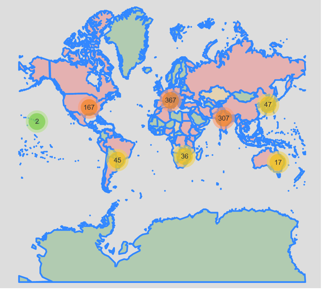
Lets cluster nearby rows to improve readability.
clusters_map = folium.Map(zoom_start=4, tiles="CartoDB dark_matter")

clusters_map_cluster = MarkerCluster().add_to(clusters_map)

# create an individual marker for each meteorite, adding it to a cluster
for coord in [tuple(x) for x in geo_df.to_records(index=False)]:
    latitude = coord[7]
    longitude = coord[8]
    mass = coord[3]
    name = coord[4]
    rec_class = coord[6]
    index = geo_df[(geo_df["reclat"] == latitude) & (geo_df["reclong"] == longitude)].index.tolist()[0]

    html = f"""
    <table border="1">
        <tr>
            <th> Index </th>
            <th> Latitude </th>
            <th> Longitude </th>
            <th> Mass </th>
            <th> Name </th>
            <th> Recclass </th>
        </tr>
        <tr>
            <td> {index} </td>
            <td> {latitude} </td>
            <td> {longitude} </td>
            <td> {mass} </td>
            <td> {name} </td>
            <td> {rec_class} </td>
        </tr>
    </table>"""
    iframe = folium.IFrame(html=html, width=375, height=125)
    popup = folium.Popup(iframe, max_width=375)

    folium.Marker(location=[latitude, longitude], popup=popup).add_to(clusters_map_cluster)

clusters_map.save(output_directory + "clusters_map.html")
clusters_map
clusters_map.html (may take a moment to load)
This looks much better.
Just for kicks, lets make a heat map as well!
heat_map = folium.Map(zoom_start=4, tiles="CartoDB dark_matter")

# Ensure you're handing it floats
geo_df['latitude'] = geo_df["reclat"].astype(float)
geo_df['longitude'] = geo_df["reclong"].astype(float)

# Filter the DF for rows, then columns, then remove NaNs
heat_df = geo_df[['latitude', 'longitude']]
heat_df = heat_df.dropna(axis=0, subset=['latitude','longitude'])

# List comprehension to make out list of lists
heat_data = [[row['latitude'],row['longitude']] for index, row in heat_df.iterrows()]

# Plot it on the map
HeatMap(heat_data).add_to(heat_map)

# Display the map
heat_map.save(output_directory + "heat_map.html")
heat_map
We see here that most of the meteorites land on land. My prediction is that meteorites do in fact land in water, probably more often than land due to water’s higher proportion on Earth, but all the meteorites must be reported by humans, which explains all of the data points existing on land.
I’d go as far to say that higher populated areas are more likely to report meteorites, as well as non first world countries.
Census Data
Now we’ll explore the notion that higher populated areas are more likely to report meteorites, visually. We’ll do that by combing population data gathered from a census. The logic for our heat map of our countries is rudimentary, as it does not act as a density factoring in land mass, but is good enough for this example.
Lets start by redoing our first graphic, where every meteorite got its own marker, and we’ll overlay the population of the world by country.
markers_census_layered_map = folium.Map(zoom_start=4, tiles='Mapbox bright')

fg = folium.FeatureGroup(name="Meteorites")

# create an individual marker for each meteorite, adding it to a layer
for coord in [tuple(x) for x in geo_df.to_records(index=False)]:
    latitude = coord[7]
    longitude = coord[8]
    mass = coord[3]
    name = coord[4]
    rec_class = coord[6]
    index = geo_df[(geo_df["reclat"] == latitude) & (geo_df["reclong"] == longitude)].index.tolist()[0]

    html = f"""
    <table border="1">
        <tr>
            <th> Index </th>
            <th> Latitude </th>
            <th> Longitude </th>
            <th> Mass </th>
            <th> Name </th>
            <th> Recclass </th>
        </tr>
        <tr>
            <td> {index} </td>
            <td> {latitude} </td>
            <td> {longitude} </td>
            <td> {mass} </td>
            <td> {name} </td>
            <td> {rec_class} </td>
        </tr>
    </table>"""
    iframe = folium.IFrame(html=html, width=375, height=125)
    popup = folium.Popup(iframe, max_width=375)

    fg.add_child(folium.Marker(location=[latitude, longitude], popup=popup))

# add our markers to the map
markers_census_layered_map.add_child(fg)

# add the census population outlined and colored countries to our map
world_geojson = os.path.join(data_directory, "world_geojson_from_ogr.json")
world_geojson_data = open(world_geojson, "r", encoding="utf-8")
markers_census_layered_map.add_child(folium.GeoJson(world_geojson_data.read(), name="Population", style_function=lambda x: {"fillColor":"green" if x["properties"]["POP2005"] <= 10000000 else "orange" if 10000000 < x["properties"]["POP2005"] < 20000000 else "red"}))

# add a toggleable menu for all the layers
markers_census_layered_map.add_child(folium.LayerControl())

# save our map as a separate HTML file
markers_census_layered_map.save(outfile=output_directory + "markers_census_layered_map.html")

# display our map inline
markers_census_layered_map
markers_census_layered_map.html (may take a moment to load)
This is a good start, but again its difficult to see what’s truly going on due to the sheer number of markers. Lets cluster our markers again:
markers_census_layered_map = folium.Map(zoom_start=4, tiles='Mapbox bright')

clusters_map_cluster = MarkerCluster(
    name="Meteorites",
    overlay=True,
    control=False,
    icon_create_function=None
)

# create an individual marker for each meteorite, adding it to a cluster
for coord in [tuple(x) for x in geo_df.to_records(index=False)]:
    latitude = coord[7]
    longitude = coord[8]
    mass = coord[3]
    name = coord[4]
    rec_class = coord[6]
    index = geo_df[(geo_df["reclat"] == latitude) & (geo_df["reclong"] == longitude)].index.tolist()[0]

    html = f"""
    <table border="1">
        <tr>
            <th> Index </th>
            <th> Latitude </th>
            <th> Longitude </th>
            <th> Mass </th>
            <th> Name </th>
            <th> Recclass </th>
        </tr>
        <tr>
            <td> {index} </td>
            <td> {latitude} </td>
            <td> {longitude} </td>
            <td> {mass} </td>
            <td> {name} </td>
            <td> {rec_class} </td>
        </tr>
    </table>"""
    iframe = folium.IFrame(html=html, width=375, height=125)
    popup = folium.Popup(iframe, max_width=375)

    clusters_map_cluster.add_child(folium.Marker(location=[latitude, longitude], popup=popup))

# add our cluster to the map
markers_census_layered_map.add_child(clusters_map_cluster)

# add the census population outlined and colored countries to our map
world_geojson = os.path.join(data_directory, "world_geojson_from_ogr.json")
world_geojson_data = open(world_geojson, "r", encoding="utf-8")
markers_census_layered_map.add_child(folium.GeoJson(world_geojson_data.read(), name="Population", style_function=lambda x: {"fillColor":"green" if x["properties"]["POP2005"] <= 10000000 else "orange" if 10000000 < x["properties"]["POP2005"] < 20000000 else "red"}))

# add a toggleable menu for all the layers
markers_census_layered_map.add_child(folium.LayerControl())

# save our map as a separate HTML file
markers_census_layered_map.save(outfile=output_directory + "markers_census_layered_map.html")

# display our map inline
markers_census_layered_map
clusters_census_layered_map.html (may take a moment to load)
Now we can see all data much clearer thanks to the clustering. At this point we could start adding in additional layers, like the gross domestic product of each country to try and inspect other relations.
Conclusion
We’ve demonstrated how to:
- display geospatial data
- cluster close points
- generate a heat map
- overlay census population data
With these skills, one can quickly generate helpful visualizations for geospatial data. Moving forward, we could use different markers depending on some value, like Recclass in this instance, or improve the popup text.
I hope this helps you with working with geospatial data.
References
To do this work, I had the help from: